Probability and StatisticsChapter 2
Descriptive Statistics
In this chapter
A list of numbers is not yet a description of anything. This chapter turns raw data into a small set of pictures and numbers that say what it actually looks like: its shape, its center, and its spread. Each tool builds on the last, from through to the that closes the chapter.
Reading a Histogram: Where the Data Piles Up
A histogram displays data by grouping values into equal-width intervals, or bins, and drawing a bar over each whose height is the count, or proportion, of values it contains.
Check two things: the bars touch, since the bins share boundaries along one continuous scale; and bar height encodes frequency, never the raw values themselves. A stem-and-leaf plot, line graph, or bar graph can also display data, but only a histogram bins a wide-ranging quantitative variable this way.
A bootcamp records completion time, in hours, for 60 hypothetical learners. Sorted into equal-width bins, most bars cluster mid-range, with one or two shorter bars stretching out to one side — the shape a histogram exists to reveal at a glance, before any single number is calculated.
"A histogram is just a bar chart, so the bars can be reordered however looks best." A bar chart's categories carry no inherent order and its bars are drawn separated; a histogram's bins are numeric, fixed in sequence, and touching, because order is itself part of what the picture shows. "The tallest bar shows the single most common value." It shows the most populated bin, which can hold many different values — a histogram trades individual values for a view of the data's overall shape.
Percentiles and Quartiles: Locating a Value in the Data
The p-th percentile is the value below which p percent of the data falls. Quartiles are the three percentiles that cut ordered data into four equal-sized groups: (25th percentile), the median (50th), and (75th).
Sort the data first — percentile rank is meaningless on an unsorted list. To place a value, ask what share of the sorted data sits at or below it, not its raw size. The interquartile range, , measures the middle half's width, and a value more than below or above is flagged as a likely outlier.
A hypothetical placement test reports scores by percentile. A score at the 40th percentile means 40% of test-takers scored at or below it — most of the field scored higher, even though 40 sounds middling out of 100.
"Scoring in the 90th percentile means answering 90% of the questions correctly." Percentile rank compares you to other test-takers, not to a perfect score — a 90th-percentile result could be a raw 65% if everyone else scored lower still. " and always sit the same distance from the median." Only for symmetric data: quartiles are defined by rank, not distance, so lopsided data routinely stretches further on one side.
The Box Plot: Five Numbers, One Picture
A box plot (box-and-whisker plot) draws a dataset's five-number summary — minimum, , median, , maximum — in one picture: a box from to with a line at the median, and whiskers to the minimum and maximum. John Tukey popularized the form in a 1977 book.
The box's width is the , holding the middle half of the data; it shows where that half starts and ends, not how many points sit inside. A median line off-center in the box, or one whisker much longer than the other, signals a lopsided distribution before any arithmetic.
A hypothetical tutoring service samples 9 students and logs minutes spent reviewing flashcards before a quiz: 12, 15, 18, 20, 22, 25, 28, 33, and 60 — one reviewed far longer than the rest. The worked construction below builds its box plot.
- Sort the data. 12, 15, 18, 20, 22, 25, 28, 33, 60 (already sorted; ).
- Find the median. is odd, so the median is the middle (5th) value: 22.
- Find . The median of the lower four values (12, 15, 18, 20): .
- Find . The median of the upper four values (25, 28, 33, 60): .
- State the five-number summary. Min , , median , , max ; draw the box from 16.5 to 30.5, the median line at 22, and whiskers out to 12 and 60.
Common slips: forgetting to re-sort before splitting the halves, and including the median itself in both halves when is odd, which shifts and .
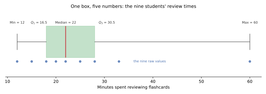
"A wider box means more data is packed inside it." Unlike a histogram: box width shows how spread out the middle half is, not how many points are there — a box plot carries no frequency information at all. "The line inside the box is the mean." It is the median; the mean is not marked on a standard box plot and, when data is skewed, can sit well outside the box.
Mean, Median, and Mode: Three Kinds of Center
The mean — for a sample, or for a population — adds every value and divides by the count. The median is the sorted data's middle value, or the average of its two middle values when the count is even. The mode is the most frequent value; a dataset can have none, one, or several.
The mean uses every value's size, so an extreme value pulls it; the median uses only rank and barely moves. When no value repeats, the dataset has no mode — a valid description, not a gap.
The same 9 students from the above spent 12, 15, 18, 20, 22, 25, 28, 33, and 60 minutes. The mean is ; the median, the 5th sorted value, is 22. All nine minutes are distinct, so there's no mode.
"The mean is always the best measure of center, so it's always the right one to report." Here the mean, 25.9, exceeds all but one value, pulled up by that one student's 60 minutes, while the median, 22, better represents a typical student — neither is wrong, but picking whichever looks better is dishonest. "Every dataset has exactly one mode." A dataset can have none, as here, one, or several equally common values.
Skewness: When the Tail Pulls the Mean Away
A distribution is skewed when one tail stretches further than the other, and symmetric when neither does. Skew pulls the toward the long tail while the median resists it, so the gap between them reads out the skew.
Find the longer tail first, then name the skew after it: right-skewed if it stretches right, left-skewed if left. An off-center median in a is often the first visible sign. Right-skewed data typically has mean greater than median, and left-skewed data typically the reverse — a generalization, OpenStax notes, that can fail on some discrete datasets.
Back to the 9 students: the , 25.9, sits above the median, 22, pulled up by the one 60-minute outlier — a right-skewed , long tail right, most students bunched low.
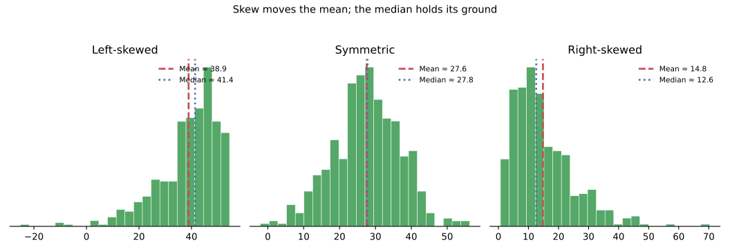
"Right-skewed means most of the data is on the right." The opposite: the tail, not the bulk, is on the right; most values, and the mode, sit on the low side where the bars are tallest. "The mean is still the most representative measure even when data is skewed." Skew is exactly what pulls the mean from where most data sits — resisting that pull is the median's job.
Standard Deviation and Variance: Measuring the Spread
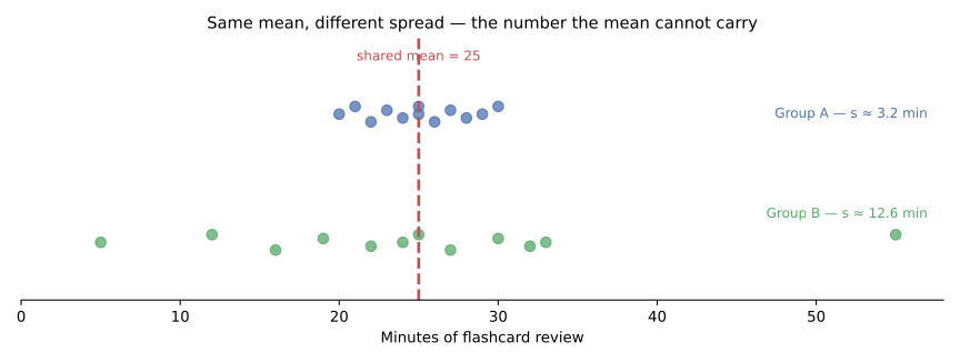
The standard deviation measures the typical distance between a data value and the , in the data's own units; the variance is the same idea in squared units, before the square root is taken. A sample uses , dividing by ; a population uses , dividing by .
Ask what a "typical" distance from the mean looks like, not just the distance between the two extremes — standard deviation uses every value, so one distant point moves it, but far less than it moves the range. Two datasets can share a mean and a range and still have very different standard deviations.
The same 9 students' minutes give . The worked computation below finds the sample standard deviation .
- Find the mean. .
- Find each deviation and square it. For example, , squared ; repeat for all nine values.
- Sum the squared deviations. .
- Divide by . , the sample variance.
- Take the square root. minutes.
Common slip: dividing by instead of for a sample, which understates .
"A bigger standard deviation just means the numbers themselves are bigger." Scale and spread are independent: exam scores in the 90s can vary more, point to point, than ages in the 20s. "Standard deviation and range measure basically the same thing." The range uses only the two extremes; standard deviation uses every value, so one stray point moves the range a great deal and the standard deviation only slightly.
Describing One Dataset, Start to FinishSynthesis
Put the nine students' flashcard minutes through every tool in this chapter and they agree on one story. A of many such samples would show a tall cluster on the low end and a thinning tail toward the high one. The , 16.5 and 30.5, box the middle half; the built from them shows a median line sitting closer to the box's low side than its high one — a visual tell of skew before any arithmetic. The , 25.9 and 22, disagree by close to four minutes, and that gap is made numeric: the one 60-minute outlier pulls the mean toward the tail while the median holds its ground. The , about 14.3 minutes, says how far a typical student's time sits from that pulled-up mean — a number that would mean little without the shape, center, and quartiles already in hand. No picture here replaces the numbers, and no number replaces the picture; a dataset is fully described only when both agree.
Sources
- 1 OpenStax Introductory Statistics §2.1: Stem-and-Leaf Graphs (Stemplots), Line Graphs, and Bar Graphs — source
- 2 OpenStax Introductory Statistics §2.2: Histograms, Frequency Polygons, and Time Series Graphs — source
- 3 OpenStax Introductory Statistics §2.3: Measures of the Location of the Data — source
- 4 OpenStax Introductory Statistics §2.4: Box Plots — source
- 5 OpenStax Introductory Statistics §2.5: Measures of the Center of the Data — source
- 6 OpenStax Introductory Statistics §2.6: Skewness and the Mean, Median, and Mode — source
- 7 OpenStax Introductory Statistics §2.7: Measures of the Spread of the Data — source
- 8 Wickham & Stryjewski, "40 Years of Boxplots" (on John Tukey's 1977 introduction of the box plot) — source
- 9 R stats::quantile documentation — nine quantile types after Hyndman & Fan (1996); type 7 is R's default — source
- 10 NIST/SEMATECH e-Handbook of Statistical Methods §1.3.3.7: Box Plot (the fence-based box plot is a variation; whiskers end at the farthest observations inside the inner fences) — source
- 11 R graphics::boxplot documentation (default range = 1.5; whiskers end at the most extreme data point within range and outliers are drawn as points) — source
- 12 Matplotlib 3.11.1 pyplot.boxplot documentation (default whis = 1.5; whiskers end at the farthest data within the cutoff and values beyond are plotted as outliers) — source